A gallery wall is one of the few things you can do to a blank wall that changes the whole room. It is also one of the easiest to get wrong. The difference between a wall that looks composed and one that looks like it happened by accident comes down to three or four decisions, none of them expensive.
Start with the anchor, not the arrangement
Pick the largest piece first and decide where it goes. Everything else arranges itself around it. Most people start by laying out all the frames at once, which is how you end up moving nails for an hour. The anchor does not have to sit in the middle — off-centre often reads better, especially above a sideboard or a bench.
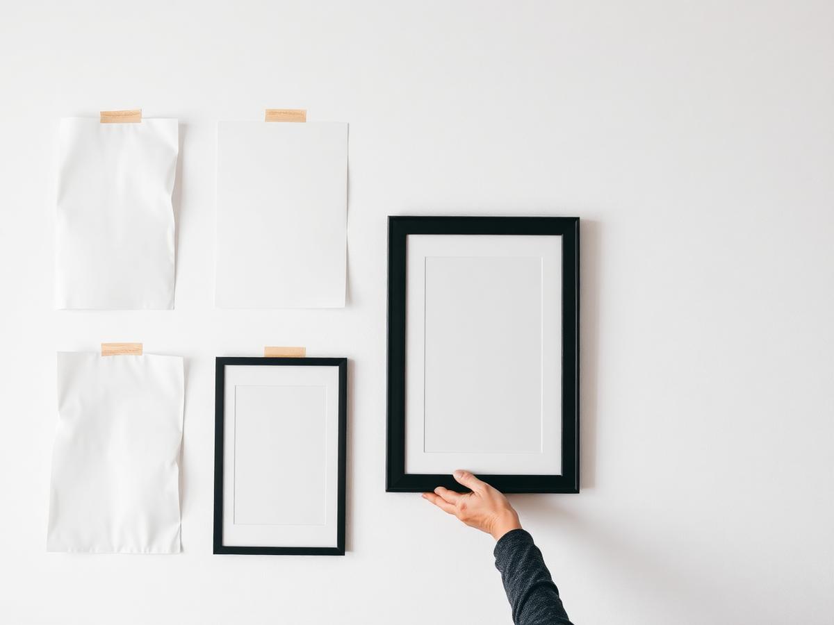
Paper templates save the plaster
Cut a sheet of paper to the size of each frame and tape it to the wall. Live with it for a day. You will move at least two of them, and you will move them on paper instead of on the wall. Mark the hanging point on each template so the nail goes in exactly where the hook needs it.
One rule about spacing
Keep the gaps between frames equal and keep them tight — five to seven centimetres works for most sets. Wide gaps make a group read as separate pictures rather than one composition. The gap is doing structural work: it is what tells the eye that these things belong together.
Hang lower than feels right
The centre of the arrangement should sit around 145 to 150 cm from the floor. Almost everyone hangs too high the first time. Above furniture, leave 15 to 20 cm between the top of the sideboard and the bottom frame, so the group relates to the furniture instead of floating above it.
Break one rule, deliberately
A perfectly regular grid is calm but slightly dead. One piece that breaks the alignment — a small print set lower, a landscape format among portraits — gives the wall somewhere to breathe. One. Two starts to look like a mistake.

Leave a Reply